Search Our Products

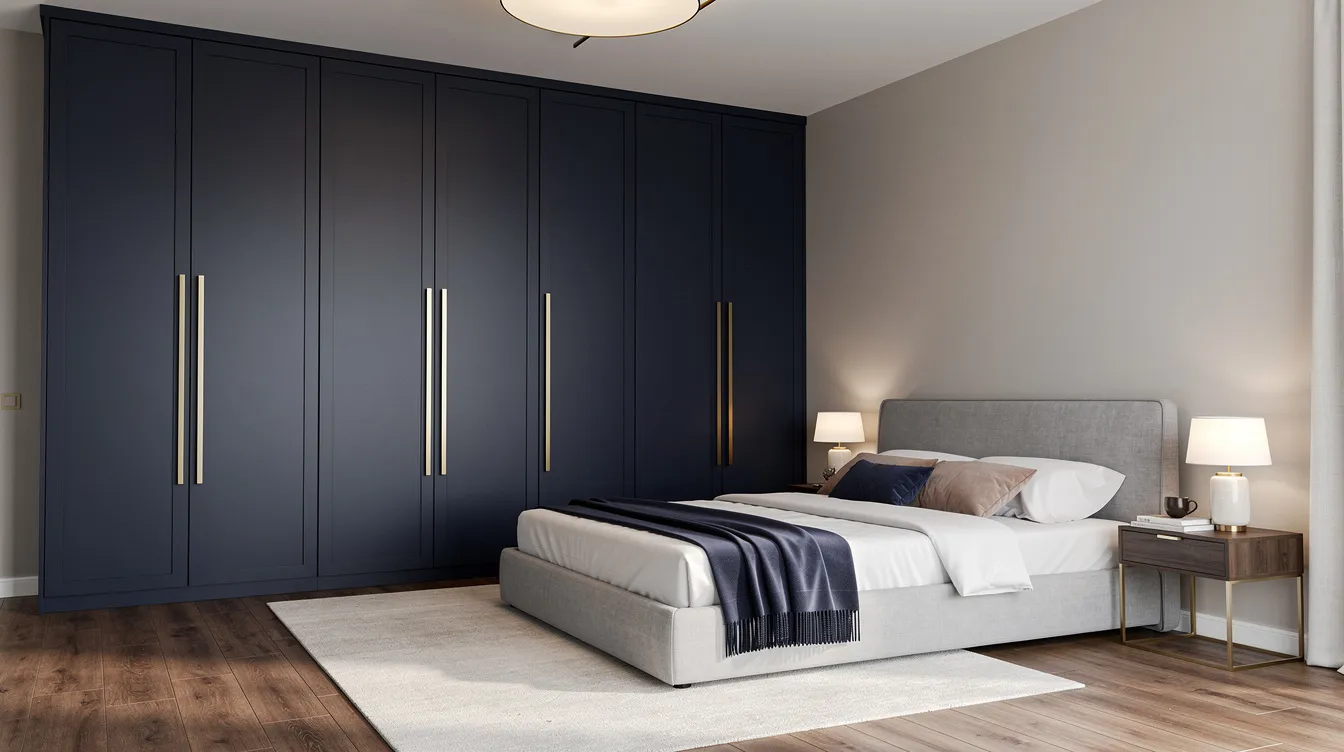
Choosing the right wardrobe colour combination can completely transform your bedroom from a simple sleeping space into a sophisticated retreat. Since wardrobes typically occupy 20-30% of your bedroom’s wall space, their colour palette becomes a dominant visual element that shapes the entire room’s character.
The perfect colour combination of wardrobe does more than look appealing—it influences how spacious your room feels, affects your mood, and ties together your overall design scheme. From timeless neutrals like white and walnut to bold contemporary pairings like navy blue and gold, today’s wardrobe laminate colour combination options offer something for every taste.
This guide walks you through 20 carefully selected combinations, helping you find the wardrobe colour scheme that matches your style, room size, and lifestyle needs.
Your wardrobe colour choice impacts far more than aesthetics. Here’s why it deserves careful consideration:
Visual space perception: Light colours reflect up to 80% of incident light, making small rooms feel 10-15% larger, while dark colours add depth and intimacy to spacious bedrooms
Mood and sleep quality: Studies indicate that cool blues and greens reduce stress by 15-20% in sleep environments, directly affecting rest quality
Design harmony: A well-chosen cupboard colour combination creates cohesion with flooring, wall colours, and furniture
Practical maintenance: Some colour choices hide dust and fingerprints better than others—matte finishes on darker tones require less frequent cleaning
Long-term satisfaction: The right colour combination works across seasons, lighting conditions, and evolving decor preferences
In Indian homes where room sizes average 10x12 feet, the wardrobe colour choice becomes even more critical for creating balance and avoiding visual overwhelm.
This timeless two colour combination pairs crisp white surfaces with warm walnut wood tones for effortless elegance.
Why It Stands Out: The contrast between bright white panels and walnut’s natural grain creates a perfect balance—white reflects light while walnut adds warmth and character.
Best For: Small to medium bedrooms seeking a spacious feel with natural warmth
Key Strengths: Achieves 90% versatility across design styles from Scandinavian to Indo-fusion, boosts perceived spaciousness by 20%, and complements virtually any room’s decor
Possible Limitations: White surfaces may show fingerprints easily, requiring microfiber cleaning every couple of weeks
This monochromatic pairing creates depth through subtle tonal shifts from light grey to deep charcoal grey.
Why It Stands Out: The gradual transition between grey wardrobe tones adds dimension without introducing competing colours, perfect for a sleek and contemporary look.
Best For: Contemporary interiors and minimalist design preferences
Key Strengths: Hides dust three times better than light colours, pairs beautifully with metallic accents, and maintains a timeless aesthetic
Possible Limitations: Can feel cold without proper warm lighting (aim for 3000K LEDs) in north-facing rooms
This earthy colour combination brings cozy warmth through harmonious natural tones.
Why It Stands Out: Warm beige softens the richness of coffee brown, creating an inviting atmosphere that complements wooden furniture and wooden textures throughout the space.
Best For: Traditional and rustic bedroom wardrobe styles, master bedrooms with teak or oak flooring
Key Strengths: Creates an inviting atmosphere, pairs well with brass hardware and matte gold handles, offers enduring appeal reminiscent of classic Anglo-Indian estates
Possible Limitations: May appear dated without modern accent pieces; can make small rooms feel enclosed without glossy finishes
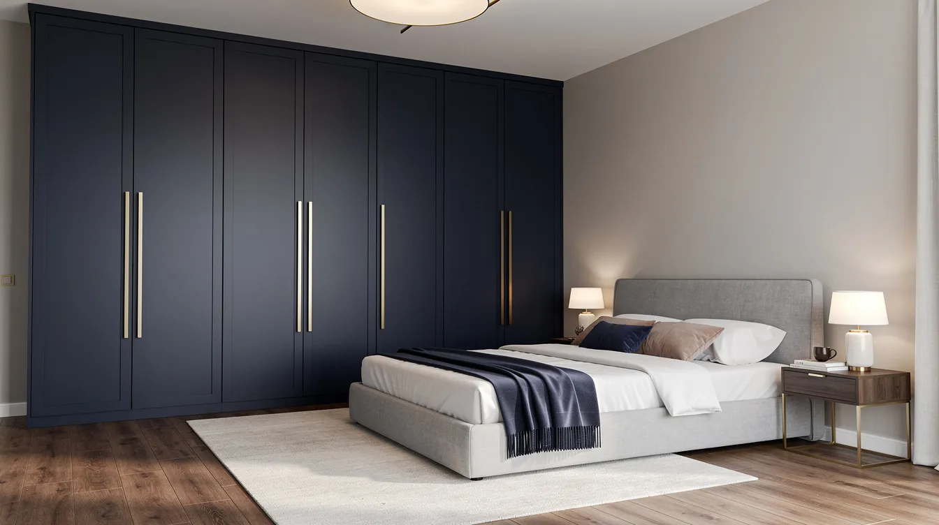
This luxurious pairing creates dramatic impact through the interplay of deep colour and reflective metallic surfaces.
Why It Stands Out: Navy absorbs 90% of light, creating depth, while gold accents reflect brilliantly—together they deliver five-star hotel sophistication.
Best For: Master bedrooms seeking luxury hotel-inspired elegance and walk in closets requiring a focal point
Key Strengths: Creates a striking contrast and focal point, works seamlessly with brass fixtures, adds remarkable visual depth
Possible Limitations: Requires adequate natural lighting; may overpower small rooms unless balanced with mirrored panels
This nature-inspired combination channels biophilic design principles for calm and relaxation.
Why It Stands Out: Muted sage green promotes sleep through wavelengths associated with natural environments, while cream provides soft contrast.
Best For: Bedrooms seeking relaxation and connection with nature, especially those with indoor plants
Key Strengths: Studies link these natural tones to 25% faster relaxation; versatile with plants and natural texture elements
Possible Limitations: May appear muted in rooms with limited natural light; works best in south-facing spaces
This high-contrast classic delivers bold statement impact through dramatic opposition.
Why It Stands Out: With a contrast ratio of 21:1, this pairing creates geometric appeal and visual interest that never goes out of style.
Best For: Modern interiors with strong architectural elements and contemporary styling
Key Strengths: Always in style, works with any accent colour, creates dramatic impact; the ultimate modern wardrobe choice
Possible Limitations: Can feel stark without softening textiles; black surfaces show dust prominently
This rich pairing combines royal depth with soft elegance for refined sophistication.
Why It Stands Out: Burgundy’s jewel-like richness creates luxury, while cream prevents the combination from feeling heavy.
Best For: Traditional and classic wardrobe design preferences, formal master bedrooms
Key Strengths: Creates luxurious feel, pair beautifully with gold fixtures and traditional wooden furniture
Possible Limitations: May feel heavy in small spaces; requires layered lighting to showcase the colours properly
This contemporary double colour wardrobe design balances vibrant personality with sophisticated metallic coolness.
Why It Stands Out: Teal’s vibrancy creates energy while silver provides sleek, modern balance—a modern two colour combination with coastal undertones.
Best For: Contemporary bedrooms and spaces with coastal or industrial themes
Key Strengths: Adds personality without overwhelming, works excellently with chrome hardware and sliding doors
Possible Limitations: Trend-dependent; may require updates as design styles evolve over the next few years
This gentle pairing creates romantic femininity through subtle warmth and brightness.
Why It Stands Out: Blush pink (a sophisticated evolution of soft pink) combined with white creates feminine charm without appearing childish.
Best For: Guest bedrooms, young adults’ rooms, and romantic bedroom themes
Key Strengths: Reflects light beautifully, creates calming atmosphere, works with both modern and vintage accessories
Possible Limitations: May not appeal to all household members; can appear too delicate for some preferences
This grounding combination brings woodland tranquility indoors through bold colours paired with warm wood tones.
Why It Stands Out: Forest green creates a cocoon-like atmosphere while oak’s warmth prevents the space from feeling dark.
Best For: Bedrooms with abundant natural light and nature-inspired decor
Key Strengths: Creates connection with nature, works beautifully with copper accents and bronze hardware
Possible Limitations: Can feel dark in poorly lit rooms; best suited for larger spaces
Ready to bring these stunning colour combinations to life?
Aristo’s premium sliding wardrobe collection features over 200 laminate options with finishes that bring these combinations to perfection. Our expert designers offer free consultations to help you select the ideal wardrobe colour for your specific space—with customization options that ensure perfect fit and finish.
Book Your Free Design Consultation and discover how the right sliding wardrobe transforms your bedroom.
This sophisticated neutral pairing offers subtle elegance through soft neutrals with golden undertones.
Why It Stands Out: Champagne’s gentle shimmer adds interest while taupe provides grounding warmth—together they create understated luxury.
Best For: Master bedrooms seeking refined ambiance without bold statements
Key Strengths: Versatile with accessories across styles, creates warm ambiance, works with both gold and silver metallic accents
Possible Limitations: May lack visual interest for those preferring bolder palettes
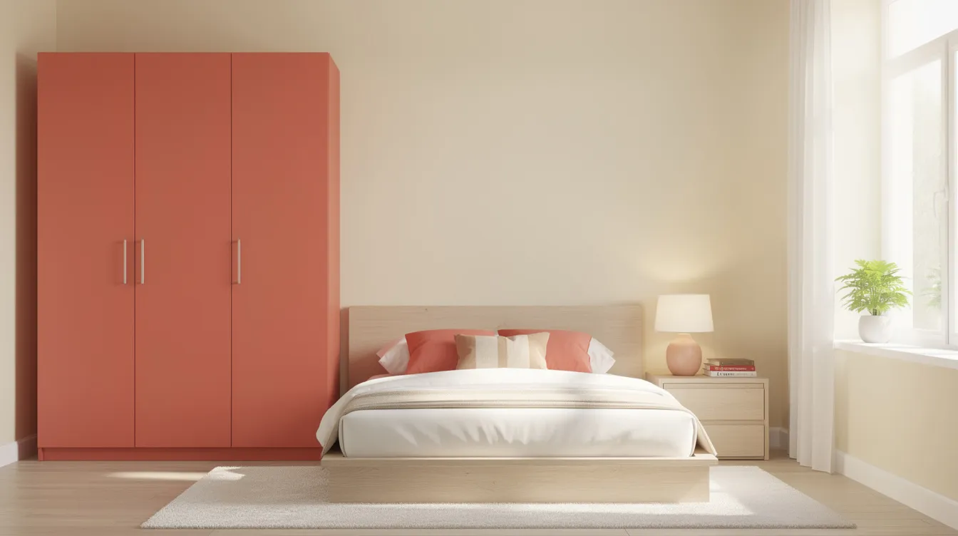
This energetic yet balanced combination adds warmth through playful contrast.
Why It Stands Out: Coral brings tropical energy while cream maintains sophistication—a refreshing modern twist on neutral palettes.
Best For: Bedrooms needing energy boost and tropical-inspired themes
Key Strengths: Creates welcoming atmosphere, works well with natural light and light flooring
Possible Limitations: May be too bold for conservative tastes; works best in well-lit spaces
This serene pairing combines calming purple tones with cool metallic finish for spa-like tranquility.
Why It Stands Out: Lavender promotes relaxation while silver adds contemporary edge—ideal for creating a dreamy retreat.
Best For: Bedrooms seeking tranquil, spa-like atmosphere with modern elements
Key Strengths: Promotes relaxation, works beautifully with soft lighting and pastel shades
Possible Limitations: May feel cold in north-facing rooms; benefits from warm textile additions
This warm combination creates cozy sophistication through contrast between dark and light tones.
Why It Stands Out: Chocolate brown’s richness paired with ivory’s softness delivers classic elegance suitable for traditional settings.
Best For: Traditional bedrooms and spaces with warm lighting; works well with earthy tones throughout
Key Strengths: Timeless appeal, pairs well with brass and gold hardware, complements wooden wardrobe elements
Possible Limitations: Can make small rooms feel enclosed; requires careful balance with lighter elements
This modern pairing balances industrial edge with feminine metallic warmth for on-trend appeal.
Why It Stands Out: Deep grey graphite provides grounding while rose gold adds unexpected warmth—a fresh take on dual colour wardrobes.
Best For: Contemporary bedrooms with mixed metal accents and modern hardware
Key Strengths: On-trend aesthetic, works with modern fixtures, creates visual interest through unexpected pairing
Possible Limitations: Trend-based choice that may date within 2-3 years; consider timeless alternatives for long-term satisfaction
This peaceful combination evokes calm skies and creates a bright and airy atmosphere.
Why It Stands Out: Pastel blue combined with white wardrobe panels creates coastal tranquility and spaciousness—perfect for restful sleep.
Best For: Guest bedrooms and spaces seeking peaceful retreat atmosphere
Key Strengths: Creates spacious feel, promotes restful sleep, works beautifully with light wood accents
Possible Limitations: May feel cold without warm neutrals; benefits from natural wood or brass additions
This striking two colour wardrobe design combines vibrant warmth with grounding dark tones.
Why It Stands Out: Mustard’s confidence meets charcoal’s sophistication—creating energy without chaos through bold contrast.
Best For: Bedrooms with plenty of natural light and contemporary style preferences
Key Strengths: Creates energy and warmth, works with both modern and vintage elements, makes a bold statement
Possible Limitations: Strong colour choice that may overwhelm; best in larger, well-lit spaces
This sophisticated combination offers royal depth with luxurious metallic balance.
Why It Stands Out: Plum’s richness creates drama while champagne adds luminous warmth—together they deliver sophisticated opulence.
Best For: Master bedrooms seeking drama and sophistication; gold wardrobe hardware enhances the effect
Key Strengths: Creates focal point, pairs beautifully with gold fixtures and velvet textiles
Possible Limitations: Requires careful lighting to avoid appearing too dark; best in rooms with ample natural light
This refreshing combination brings spa-like freshness with crisp, clean contrast.
Why It Stands Out: Mint green revitalizes while white keeps the palette fresh and light—ideal for a rejuvenating bedroom environment.
Best For: Bedrooms seeking revitalizing, clean aesthetic with connection to nature
Key Strengths: Creates fresh atmosphere, works well with natural materials and neutral walls
Possible Limitations: May feel too cool in rooms lacking warmth; consider adding warm textiles
This timeless pairing combines rich wood tones with soft brightness for enduring refinement.
Why It Stands Out: Mahogany’s depth and warmth paired with cream’s softness creates classic elegance that never dates.
Best For: Traditional and classic bedroom styles, formal settings with antique elements
Key Strengths: Timeless appeal, works with antique and traditional furniture, creates sophisticated atmosphere
Possible Limitations: May appear too formal for casual bedroom styles; best suited for traditional homes
Your room dimensions should directly influence your wardrobe colour choice. Here’s how to match colours to space:
Designer Tip: For small rooms with limited natural light, pair lighter shades with glossy finishes and consider adding mirrors to double the sense of space.
The right colour combination works harmoniously with your room’s dimensions and light sources:
Small rooms: Prioritize light tones that reflect natural light; a white wardrobe or soft grey creates openness
Large rooms: Embrace darker shades like navy or forest green to add intimacy and prevent the space from feeling empty
North-facing rooms: Choose warm neutrals to compensate for cooler natural light
South-facing rooms: You have flexibility—both warm wood tones and cool grey tones work well
Ensure your wardrobe colour scheme complements your overall aesthetic:
Minimalist: Soft grey, cool grey, or monochromatic combinations
Traditional: Warm beige, mahogany, and wooden textures
Contemporary: Bold contrast pairings with metallic accents
Scandinavian: White with light wood, natural tones
Luxe: Navy blue with gold, plum with champagne
Practical considerations matter for daily living:
Matte finishes hide fingerprints and minor scratches four times better than glossy surfaces
Grey wardrobes show dust less than pure white or black
Neutral combinations remain timeless for 10+ years, while trend-based choices like rose gold may date within 2-3 years
Consider adjustable shelving and adjustable shelves that work with any colour scheme for practical storage that evolves with your needs
Current Indian interior trends reflect both global influences and local preferences:
Matte Finishes: 60% of new wardrobe installations feature low-sheen matte laminates that hide fingerprints and suit India’s humid climate
Dual-Tone Designs: Vertical half-and-half patterns create 25% more depth illusion—lighter shades on top lift the gaze while darker shades below ground the design
Glass and Aluminium Hybrids: These reflect 40% more light, ideal for urban apartments with limited natural light
Biophilic Palettes: Olive green, sage, and natural tones are rising 50% year-over-year as homeowners seek nature connections
Designer Tip: Following Vastu principles, consider pastel shades for south-facing wardrobes and incorporate brass hardware for prosperity associations—elements that resonate deeply with Indian homeowners.
Finding the best wardrobe color combinations depends on your specific situation:
Choose White and Walnut if you want timeless appeal with maximum versatility across changing decor
Choose Navy Blue and Gold if you’re seeking luxury and sophistication with hotel-inspired elegance
Choose Sage Green and Cream if you prioritize calm and natural harmony for better sleep
Choose Black and White if you want bold modern impact that makes a statement
Choose Grey and Charcoal if minimal maintenance with contemporary style matters most
Steer clear of these common errors that can undermine your bedroom wardrobe’s impact:
Clashing temperature tones: Mixing warm beige with cool teal creates visual discomfort—stick to either warm or cool palettes
Ignoring lighting conditions: Dark colours in poorly lit rooms can make spaces feel 30% smaller and gloomy
Overusing dark colours in small rooms: Without mirrored panels or ample LEDs, dark wardrobes shrink perceived space significantly
Chasing short-lived trends: Ultra-trendy combinations like graphite-rose gold may date within 2-3 years
Forgetting the floor: Your wardrobe must harmonize with flooring—warm wood tones pair with earth colours, while cool grey pairs with vitrified tiles
The best wardrobe colour combination ultimately reflects your personal style while addressing your room’s specific requirements. Whether you prefer the enduring elegance of white and walnut or the dramatic sophistication of navy blue and gold, the right colour combination works when it balances aesthetics with functionality.
Consider your room size, lighting conditions, and maintenance preferences alongside your design vision. Professional guidance can help navigate these choices and ensure your investment delivers satisfaction for years to come.
Ready to bring your perfect colour combination to life? Aristo’s premium sliding wardrobe collection offers unmatched quality, with over 200 laminate options and finishes designed to suit every style preference.
Our wardrobes feature:
10-year warranty on all laminates and hardware
Custom sizing that maximizes vertical storage in any room
Premium aluminium profiles for smooth sliding doors operation
Expert design consultation at no cost
Book a free design consultation and let our specialists help you select the ideal colour combination for your space. Visit any of our showrooms across India or connect with our 400+ design partners nationwide.
Light colour combinations work best for small rooms under 120 square feet. White and walnut, light grey and white, sage green and cream, and powder blue and white are excellent choices. These lighter shades reflect 70-90% of light, making rooms feel 20-30% more spacious. Opt for glossy finishes to maximize light reflection, and consider adding mirrored panels to enhance the effect further.
Focus on neutral foundations and timeless pairings. Combinations like white-walnut, beige-coffee brown, and soft grey with warm wood accents have endured for decades. These classic choices remain stylish for 10+ years, while trend-based options like rose gold or ultra-bold colours typically date within 2-3 years. When in doubt, choose warmer neutrals with natural wood elements that transcend temporary design fads.
Yes, but with careful planning. Balance dark wardrobes with mirrored panels that effectively double the sense of space. Ensure adequate lighting (minimum 500 lux) through strategic LED placement, and keep surrounding walls light. Light flooring also helps offset the visual weight of dark wardrobes. With these elements, even navy or forest green can work in compact spaces without feeling oppressive.
Match your wardrobe palette to your floor’s undertone for 80% better harmony. For honey oak or light wood floors, consider walnut, soft grey, or cream-toned wardrobes with warm wood tones accents. Darker floors like teak pair beautifully with lighter wardrobes—white, beige, or sage green. Smoked oak flooring works exceptionally well with cool grey wardrobe options and contemporary metallic accents.
Colour psychology directly impacts sleep quality and daily wellbeing. Blues and greens reduce anxiety by 15-20% through their association with nature and calm—making sage, teal, and powder blue excellent choices for restful sleep. Warmer tones like coral and mustard energize and stimulate, better suited for morning-focused spaces. Navy creates a cocoon-like luxury feeling, while neutrals like white and grey promote clarity and calm. Choose based on how you want to feel in your bedroom.
